Case Study • UX/UI Design
Tangerine 2 Step Authentication
Project Overview
The login experience at Tangerine relied on a one-time security code sent via SMS along with secret questions. While this approach functioned as intended, it carried inherent vulnerabilities that increased the risk of account takeovers, ultimately contributing to significant fraud losses.
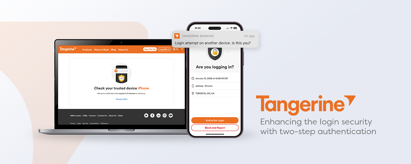
To strengthen security, we redesigned the login experience and introduced a new two-step authentication method. Clients are now required to register a trusted device, which they can use to verify their identity during future logins by approving a push notification.
Time frame for MVP1: 8 months
Role: Main designer in a Cross functional team
Within a cross-functional team comprised of Product owner, BA, developers and QAs, I led the End to end Mobile design of the project. We also collaborated with the Web team to deliver a seamless experience across both platforms.
Design Process
To launch MVP1 of 2 step Authentication, we followed a fairly straightforward Design process that included:
1. Requirement gathering
2. Alignment with desktop team
3. Designing UX journeys
4. Gathering feedbacks from teams and stakeholders
5. Refining UI to build a more delightful experience and in line with TNG design system
6. User studies and testing
7. Hand off to development, along with refining error scenarios and edge cases
Operational challenges
This initiative required close collaboration with two other Agile teams to ensure alignment across dependencies and deliver a seamless experience. Working cross-functionally meant coordinating timelines, clarifying ownership, and maintaining strong communication to keep all moving pieces on track.
Push notifications and the desktop experience were owned by a separate team, which added an additional layer of coordination. Clear handoffs and regular syncs were essential to ensure consistency across channels and avoid gaps in the user experience.
Testing the login experience across different devices required close collaboration with the QA team. We worked together to ensure a consistent experience for both iOS and Android devices. Regular communication and coordinated testing efforts helped us maintain a high standard of quality before release.
UX challenges
Two-step authentication Adoption
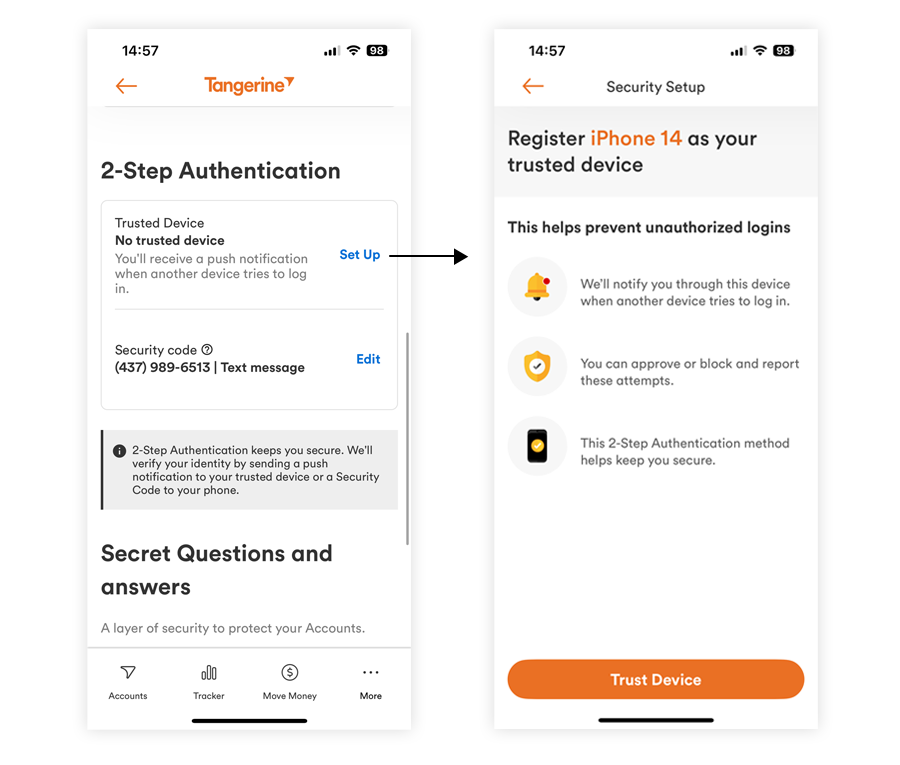
Upon the user's first time login, we aimed to reassure them while introducing multiple new security features, ensuring the experience felt supportive rather than overwhelming.
The screen mentioning 2 Step Authentication was intentionally content-driven, with clear and concise messaging to build confidence and trust. We also conducted user testing to refine the language and confirm that users clearly understood how the security feature works and what to expect during the process.
Approve a login attempt
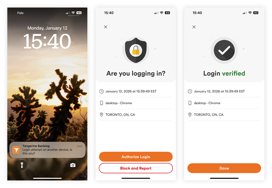
With the login screen serving as a critical security checkpoint, we needed to present key data points clearly and intuitively so users could quickly understand the context of their login attempt. The goal was to enable them to confidently approve legitimate access while also making it easy to recognize and block any suspicious or potentially fraudulent activity.
Consistent experience across platforms
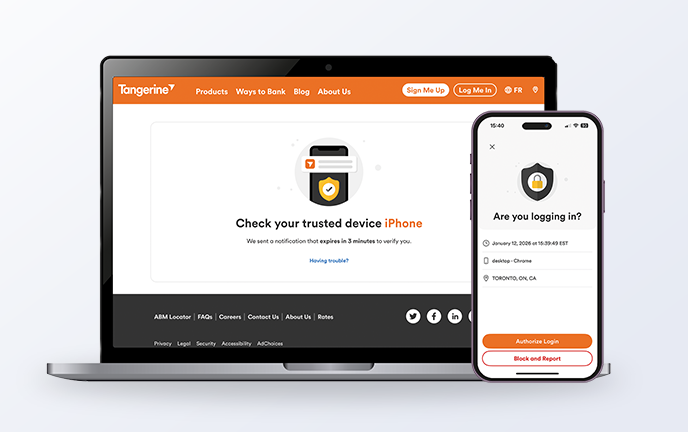
Two-step authentication is an experience that must function seamlessly across both desktop and mobile devices. Ensuring consistency across platforms helps reinforce trust and gives users confidence that their login process is secure, no matter how they choose to access their account.
Visual design
During this project, I was able to built 2 new components to improve the design system and the visual design quality
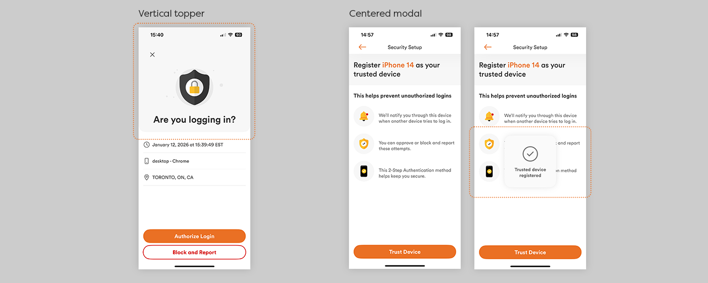
Vertical topper
It was designed to create strong visual emphasis on screens with minimal content, helping anchor the layout and draw attention to key information.
It was widely adopted across both web and mobile experiences, becoming a consistent design element that enhanced visual hierarchy and brand cohesion across platforms.
Centred modal
The centered modal was designed to provide subtle visual feedback when a task was completed, reinforcing progress without disrupting the user’s flow. It was particularly effective in multi-step processes, where clear confirmation helped guide users and maintain momentum throughout the experience.
Learnings
Security must feel safe, not just be safe.
Stronger authentication only succeeds when users understand it and feel reassured. Clear, content-driven messaging was critical to adoption.
Adoption is a UX challenge.
Introducing trusted devices required thoughtful onboarding, reduced friction, and testing for comprehension to support behaviour change.
Consistency builds trust.
Aligning mobile and web experiences reinforced credibility and helped users perceive the system as secure and reliable.
Cross-team collaboration is essential for complex systems.
Coordinating with multiple Agile teams strengthened my ability to manage dependencies, clarify ownership, and maintain alignment across channels.
Design quality extends beyond visuals, so it was crucial to include validation across platforms and real-world conditions by collaborating closely with QA.
Large initiatives are opportunities to scale design systems.
The project led to the creation of reusable components adopted across platforms, improving long-term consistency and efficiency.
MVP approach
MVP1 focused on an organic migration strategy, allowing clients to discover and enroll in two-step authentication through their Profile and Settings. As of January 2026, 20,000 clients had registered, with 85% successfully approving their logins using the new method. By closely monitoring user issues and fraud events, we’re continuing to refine the experience and prepare for a future forced migration to further strengthen client security.